A gripe of mine -- and one shared by many people -- is the existence of the Modern UI. While it may make sense on dedicated tablets, for desktop users, it creates an odd, disjointed experience. Microsoft has seen fit to make it possible to boot straight to the desktop so you would think that if you were not a fan of the Modern UI, it would be possible to avoid this side of things completely. But no.
Double click an image and it defaults to opening in the image viewer app. Why? The same is true for other file types, even if there is a built in desktop app. Being able to avoid the Start screen at boot is a good start, but there needs to be a "just bloody well disable everything related to Modern UI" setting. I'd enable it in a heartbeat.
The Windows Store does little to promote apps. The Store is much maligned for its range, breadth, depth and quality of apps. Sure, the accusation of having a lot of crappy apps is one that could be levelled at any operating system -- Windows Phone, iOS, Mac and Android stores are all guilty -- but the ratio of good to bad is worryingly low. This is obviously a subjective opinion to some extent, but the high number of incredibly low scores awarded to apps seem to back it up.
System settings could do with an overhaul. They are all over the place at the moment. There are three different sections available in the Charms bar that can be used to change settings: Control Panel, Personalization and Change PC Settings. Users shouldn’t need to remember where a particular setting needs to be changed -- this is why the Control Panel is divided up into a number of applets. There's no need to break things up further.
Shutdown should be easier to access. Closing down Windows through the Charms bar is just convoluted and strange, but there's a new option now. Right click on the Start button and select the option you need from a sub-menu. Right click? That's something reserved for access to more obscure settings, it's not something many people ever do. And why make that menu so ugly? For shutting down you're given two choices: the nice looking Modern way that takes a swipe followed by three taps, or the ugly way which is quicker, but will seem alien to a lot of users.
This next one is a minor gripe. Windows Experience Index. Why remove it? Why? It wasn't doing any harm. Yes, it wasn't the most in-depth benchmarking tool ever invented, but it was reassuring to see that Microsoft was giving your setup a stamp of approval and good to see what was holding back optimum performance.
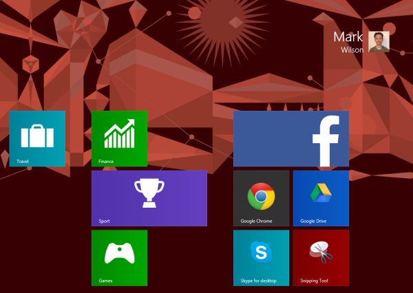
Despite my dislike of the Modern UI, I often have occasional reason to use the Charms bar. A degree of transparency would be nice here to avoid hiding what's going on on-screen. And what’s the point of the huge pop up date and time panel? As we're back on the subject of Modern UI elements, let's just admit that the Start screen is awkward, right? All that screen space and yet it's still necessary to scroll to see everything that's installed? Makes no sense. The Start menu made sense. The menu opened up to submenus so you could drill down to what you needed quickly and easily. Now whenever I find I need to launch an app I've not pinned to the taskbar, I have to play the "hunt the shortcut" game. Silliness.
Despite all this, I still love Windows 8.1. It has been installed as my main operating system from the moment preview versions were made available. Microsoft has listened to its customers, and I hope it will continue to do so. I look forward to seeing what Windows 8.2 has to offer. Are you happy with the way things have ended up, or do you think there's still room for improvement?
~ Mark Wilson
No comments:
Post a Comment